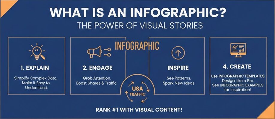
What is an Infographic
The Magic of Visual Learning: What is an Infographic?
Have you ever looked at a massive wall of text and felt your eyes glaze over? You are definitely not alone in that feeling. Most people today prefer to see information rather than just read it. This is exactly where the power of an infographic comes into play. At its heart, an infographic is a brilliant mix of images, charts, and very little text. It takes a complicated topic and makes it look like a simple, beautiful story. When you ask what is an infographic, you are really asking how to make learning fun and fast for everyone.
Think of it as a roadmap for your brain. Instead of wandering through a forest of confusing numbers, you get a clear path with bright signs. A great infographic helps you see patterns and facts that you might miss in a standard report. In the fast-paced world of the USA, where everyone is busy, these visuals are like gold. They grab your attention in a second and hold it long enough to teach you something valuable. It is the perfect tool for any brand that wants to stand out and be remembered by its audience.
Why Your Business Needs a Great Infographic
In the digital world, being helpful is the best way to win. If you want to grow your traffic, you must provide value quickly. This is why knowing what is an infographic is so vital for your success. It serves as a bridge between your hard work and the person who needs your help. When you use an infographic template, you can create professional designs that look like they cost thousands of dollars. This level of quality builds instant trust with your readers because it shows you care about their time and their experience.
People love to share things that make them look smart or helpful. A well-made infographic is one of the most shared types of content on social media today. By using clear infographic examples, you can see how others have turned boring data into viral sensations. This isn’t just about looking pretty; it is about being an authority in your field. When your visual is easy to understand, people see you as an expert. This creates a strong bond of trust, which is the secret sauce for ranking high and staying there.
Breaking Down the Best Infographic Examples
To truly understand what is an infographic, we should look at some real-world wins. Imagine a health company that wants to show the benefits of drinking water. Instead of a long paper, they use a tall, blue graphic with bubbles. Each bubble has a small fact, like “better skin” or “more energy.” This is one of those classic infographic examples that works every single time. It is easy on the eyes and gives the reader a quick win. You walk away knowing exactly why you should grab a glass of water right now.
Another great example is a timeline. Businesses often use these to show their history or how a product is made. By using a sleek infographic template, a company can show its growth from a garage startup to a global leader. You see the dates, the icons, and the progress all in one glance. This visual storytelling is much more powerful than a list of dates. It lets the reader feel the journey. Seeing these infographic examples helps you realize that the only limit to what you can create is your own imagination.
How to Choose the Right Infographic Template
Starting from a blank white screen is very scary for most people. You don’t have to be a professional artist to make something amazing. This is why using an infographic template is a smart move for any creator. These templates are like “paint by numbers” for the modern age. They give you the structure, the colors, and the fonts that already look good together. All you have to do is plug in your own unique data and words. It saves you hours of frustration and ensures your final product looks polished.
When you look for a template, think about your goal. If you have a lot of numbers, look for an infographic style that features charts and graphs prominently. If you are explaining a “how-to” process, find a template with clear steps and arrows. Knowing what is an infographic layout works best for your specific message is half the battle. A good template acts as a guide, keeping your information organized so the reader doesn’t get lost. It makes the whole process of content creation feel like a fun and creative hobby.
Comprehensive Comparison Table: Infographic Types
| Type of Infographic | Best Use Case | Key Features |
| Statistical | Sharing research and survey results | Large numbers, pie charts, and bar graphs |
| Informational | Explaining a new or complex concept | Descriptive headers and clear icons |
| Timeline | Showing the history or a sequence of events | A central line with dates and milestones |
| Process | Giving step-by-step instructions | Numbered lists and flow arrows |
| Comparison | Proving why one thing is better than another | A split layout with “Pro vs. Con” lists |
| Geographic | Visualizing data based on locations | Maps with color-coded regions |
The Science of Why Visuals Work So Well
Our brains are actually wired to process images much faster than text. Science tells us that we can understand a visual scene in less than a tenth of a second. When you ask what is an infographic, you are tapping into this natural human power. By combining words with pictures, you are helping the brain store that info in two different ways. This makes it much easier for people to remember your message later on. This is a huge advantage when you want to make a lasting impression on your visitors.
Think about a warning sign. You see the bright red color and the shape before you even read the word “Stop.” An infographic works the same way. The colors and shapes tell a story before the reader even dives into the details. Using a professional infographic template helps you use these visual cues correctly. You can lead the reader’s eye from the most important point down to the conclusion. It is a very natural and comfortable way for people to learn new things without feeling overwhelmed by too much data.
Designing for Your Audience: A Human Approach
When you create content, you must always think about the person on the other side of the screen. A great infographic is not just a data dump; it is a conversation. You want to speak to your reader like a friend who is explaining something cool. Using infographic examples from your own industry can help you see what your specific audience likes. Do they like bright, bold colors, or do they prefer a clean and corporate look? Knowing this helps you choose the right infographic template that will resonate with them on a deep level.
Remember that people are often looking for answers to their problems. If your infographic provides a clear solution, you have won their heart. Explain what is an infographic solution in a way that feels personal. Use “you” and “we” to make it feel like a shared experience. When people feel like content was made specifically for them, they are much more likely to trust the source. This human connection is what turns a simple visitor into a loyal fan of your brand or your website.
Step-by-Step Guide to Creating Your First Visual
Creating your first masterpiece is easier than you think. First, you need to gather your data and pick your main point. Once you have your facts, ask yourself what is an infographic style that fits this data. Then, go find an infographic template that matches that style. Don’t try to change too much at first. Keep the colors simple and the fonts easy to read. You want your information to be the star of the show, not the fancy decorations around it.
Next, start placing your text into the template. Keep your sentences short and punchy. If a paragraph is getting too long, see if you can turn it into a bulleted list or a small chart. Look at famous infographic examples for inspiration on how to use white space. White space is the “breathing room” in your design. It keeps the page from looking cluttered and messy. Finally, give your infographic a final check to make sure the flow makes sense. If a 5th grader can understand it, then you have done a perfect job.
Common Mistakes to Avoid in Visual Content
Even the best creators make mistakes sometimes. One big mistake is trying to put too much information into one single infographic. If the image is too long or the text is too small, people will just click away. Remember, the goal of asking what is an infographic is to find a way to simplify, not complicate. Another error is using colors that clash or make the text hard to read. You want a high contrast so that the words pop off the screen and grab the reader’s attention.
Another thing to watch out for is using bad data. Always make sure your facts are 100% correct and come from trusted sources. If you use a template, don’t forget to customize it so it doesn’t look like everyone else’s. While an infographic template is a great starting point, adding your own brand colors and unique icons makes it special. Look at high-ranking infographic examples and you will notice they all have a unique “personality.” Avoiding these common traps will help your content rank better and stay helpful for a very long time.
The Future of Visual Communication and AI
As technology grows, the way we share information is changing too. We are seeing more interactive visuals where you can click on parts of the image to see more data. However, the core idea of what is an infographic remains the same. It is all about making things clear. Even with AI tools helping us design, the human touch is what makes a graphic truly “helpful.” You still need to choose the story and the heart behind the data. This is why human-centered content will always win in the long run.
Using an infographic template powered by modern tools can speed up your work, but don’t lose your voice. Your insights and your way of explaining things are what people really want. In the future, we might see more 3D visuals or even virtual reality charts. But for now, a solid, well-designed infographic is still the king of content. It is the best way to reach people across the USA and the world. By staying focused on quality and clarity, you will always be ahead of the curve in your niche.
How to Promote Your Visual Content Effectively
Once you have finished your beautiful project, you need to show it to the world. Don’t just post it on your blog and hope for the best. Share it on Pinterest, which is a huge search engine for visuals. Use parts of your infographic as “teasers” on Instagram or X (Twitter). When people see a small piece of a great infographic examples, they will want to click through to see the whole thing. This is a powerful way to drive a lot of fresh traffic back to your main website.
You can also reach out to other websites and offer your visual as a guest post. Many editors love high-quality visuals because they add value to their own readers. When you explain what is an infographic benefit to them, they are often happy to share it. Always include a link back to your site so people can find more of your great work. Using an infographic template allows you to make many versions for different sites quickly. This strategy builds your reputation as a helpful leader and a trusted expert in your chosen topic.
Frequently Asked Questions (FAQ)
1. What is an infographic exactly?
An infographic is a visual representation of information or data. It uses a mix of images, charts, and minimal text to give an easy-to-understand overview of a topic. It is designed to be shared and learned from quickly.
2. Can I make one if I am not a designer?
Yes, absolutely! You can use an infographic template from sites like Canva or Adobe Express. These tools are made for beginners and allow you to drag and drop elements to create a professional look.
3. How long should my infographic be?
There is no set rule, but most successful infographic examples are between 600 and 1200 pixels wide. The length depends on how much data you have, but try to keep it focused so the reader doesn’t get bored.
4. Why are infographics good for my website?
They are great because they increase the time people spend on your page. They also get shared more than plain text, which helps more people find your site. They make your content look more authoritative and professional.
5. Where can I find data for my visual?
You can use government websites, academic studies, or your own original research. Always make sure to cite your sources at the bottom of your infographic to build trust with your audience.
6. Are infographics still relevant in 2026?
Yes, they are more relevant than ever! With so much content online, people want information that is fast and visual. A high-quality infographic is still one of the best ways to capture attention in a crowded digital space.
Conclusion: Start Your Visual Journey Today
In summary, understanding what is an infographic is a total game-changer for your content strategy. It allows you to take complex ideas and turn them into something that anyone can enjoy and understand. By using the right infographic template and studying successful infographic examples, you are setting yourself up for massive success. Visuals are the language of the future, and there has never been a better time to start using them. Your audience is waiting for content that is easy to digest and beautiful to look at.
Now is the time to take action and boost your presence online. Don’t be afraid to experiment with different styles and colors. The more you practice, the better your visuals will become. Remember to always keep your reader first and focus on being as helpful as possible. This “people-first” approach is what will truly help you rank and grow your traffic. You have all the tools and knowledge you need to create something legendary. Go out there and show the world what you can do!
You may also like to read : Newfoundland Dog Breed Guide